CASE STUDY • AUSTRALIA
Business Key
Brand architecture for a Western Australian regional digital group
Corporate and sub-brand identity system for a Western Australian regional digital group.
PROFESSIONAL SERVICES • AUSTRALIA
KALGOORLIE-BOULDER, WA — Brand architecture for a regional digital group: one parent, three regions, two countries.
SKU 01 • THE BRIEF
The brief
Business Key has connected Western Australian businesses with local customers since 1993, starting in printed regional directories and moving into digital platforms. Then the model went multi-region — the Goldfields, the Pilbara, the Midwest — and a New Zealand arm followed.
The moment a company adds a second region, a logo stops being a logo and becomes a family. That is where most identities break, and they break in one of two directions. Draw each region independently and the group looks like unrelated companies sharing a surname. Clone one mark four times and every region loses the local character that is the entire reason a regional directory beats a national one.
Neither failure is fixable later. Sub-brands multiply.
SKU 02 • THE IDEA
The idea
One skeleton. Four expressions.
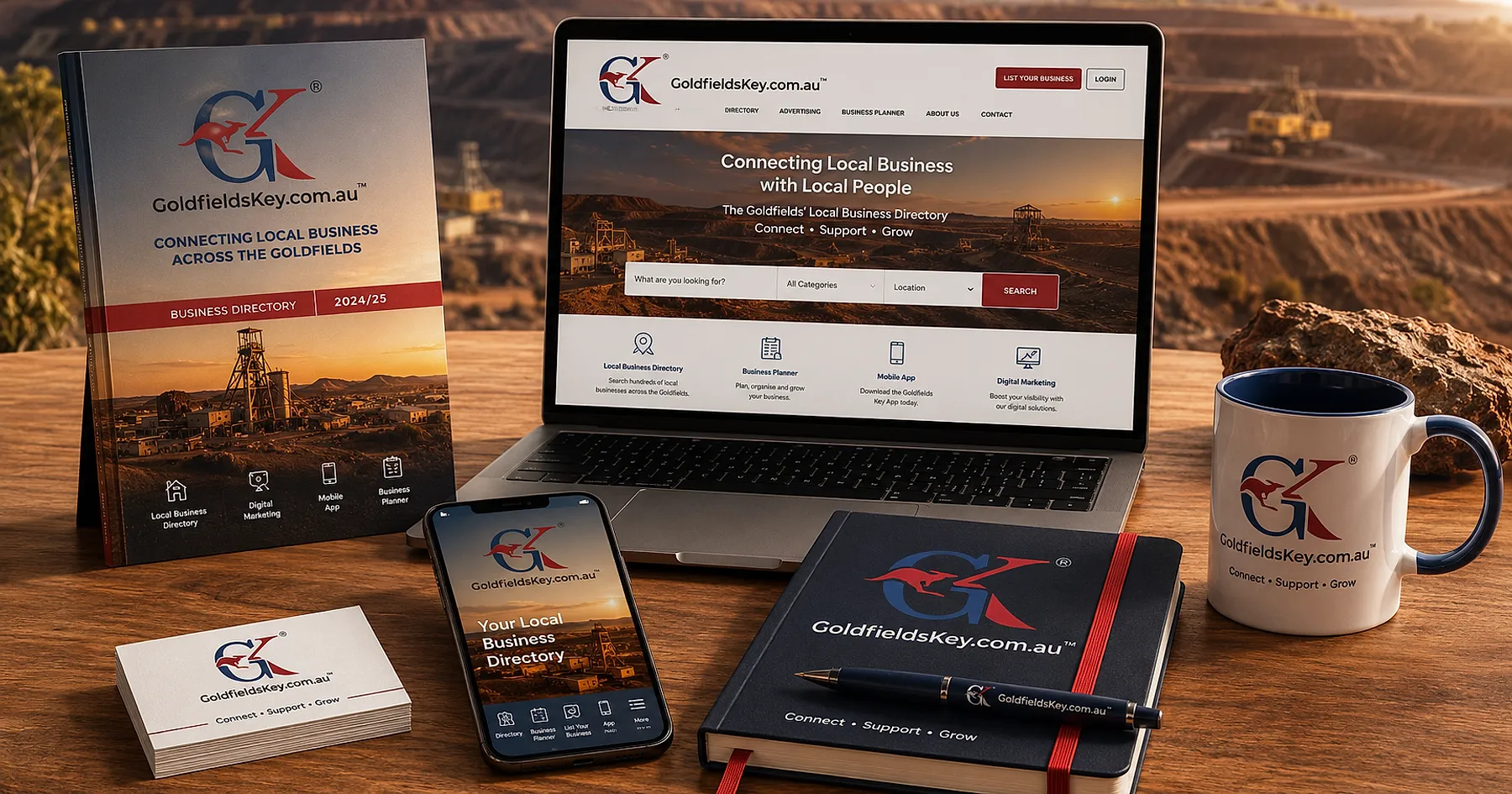
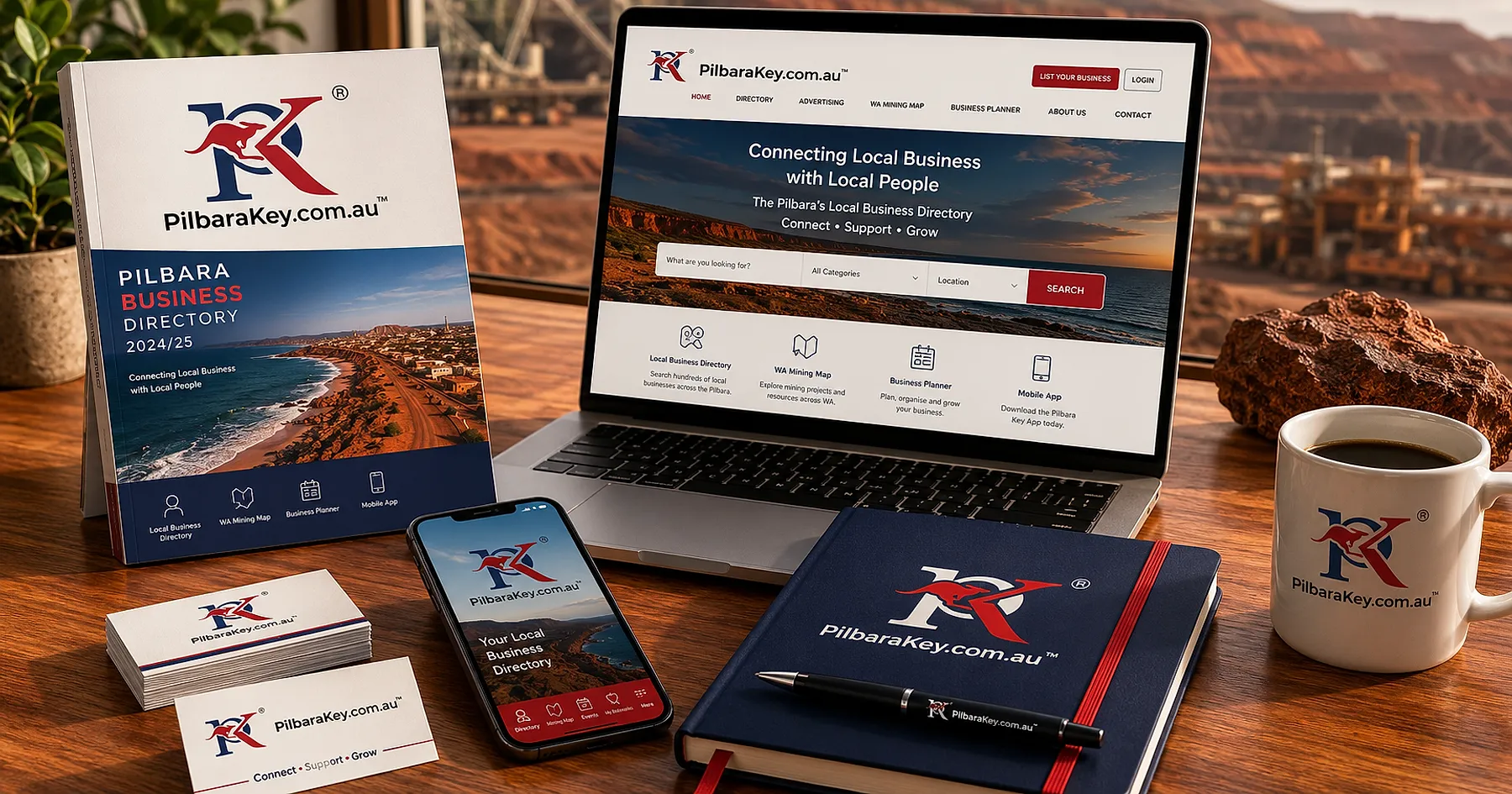
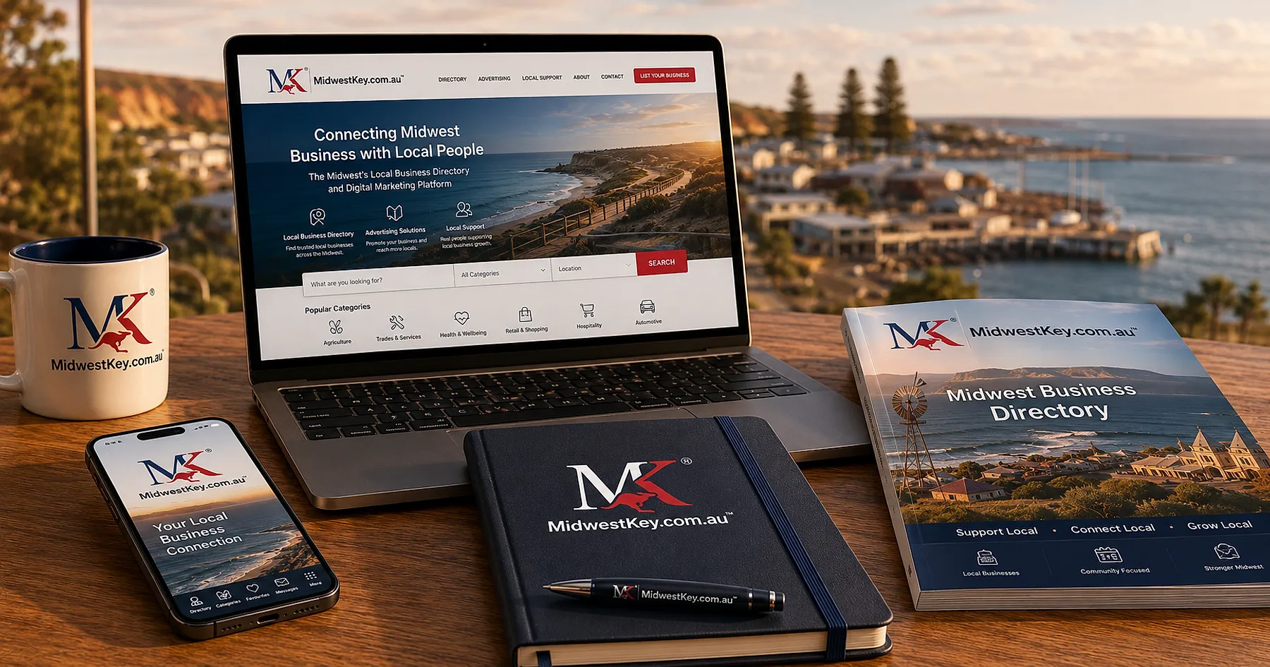
The system runs on a two-letter monogram built from shared geometry — the same curve, the same angle of attack, the same weight relationship every time. GK, PK, MK: read any one and you have read the family.
Colour does the national work. Australian flag blue and red, held identically across all four marks, so the group reads as unmistakably local before a single word is processed.
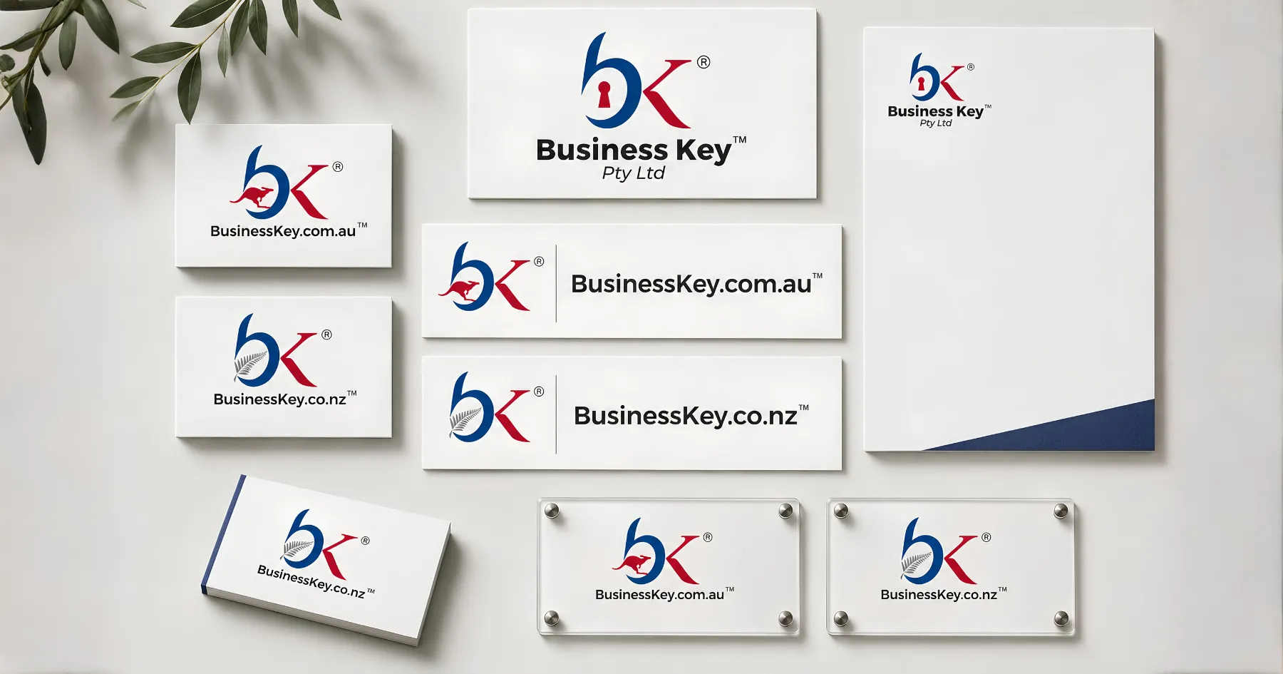
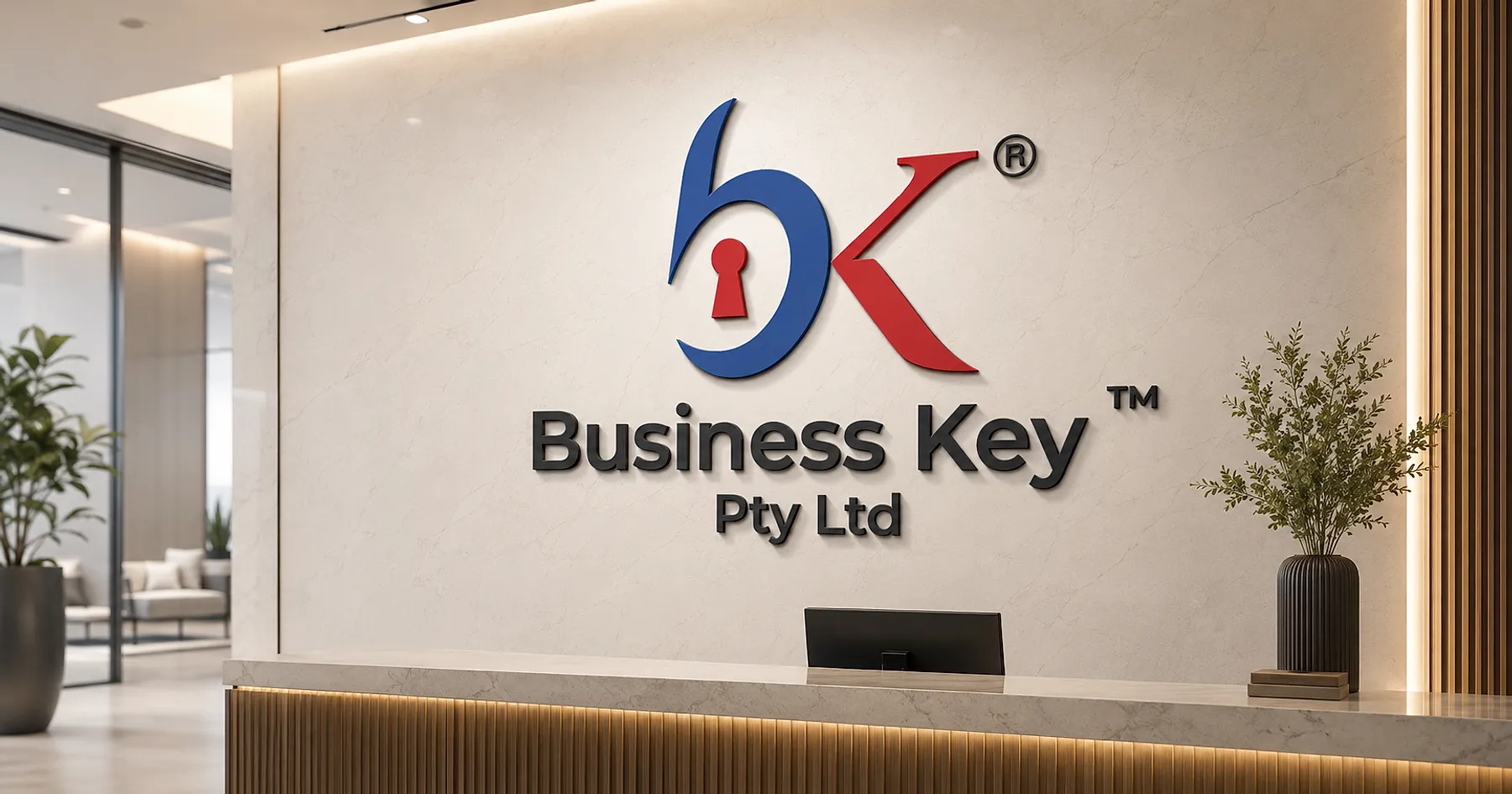
The parent mark earns its name literally: a keyhole set inside the b. Business Key — the key that opens local business. The regional marks carry a kangaroo mid-leap, tucked into the monogram's negative space rather than parked beside it, so the local signal is structural, not decorative.
The New Zealand variant is the test the system passes. Same skeleton, same colour, kangaroo swapped for a silver fern. A different country enters the family without the family being redrawn.
SKU 03 • THE SHELF RESULT
The shelf result
The system held. Business Key added regions after the identity was built, and each new mark was a variation of an existing rule rather than a fresh design problem — the parent mark never needed redrawing to accommodate them.
All three regional identities remain in service today across GoldfieldsKey.com.au, PilbaraKey.com.au and MidwestKey.com.au. Anyone can check.
WHAT WE DELIVERED
The full checkout.
- Corporate brand identity — the Business Key parent mark
- Regional sub-brand identities — Goldfields Key, Pilbara Key, Midwest Key
- New Zealand market variant
- Stationery suite
An experienced, skilled and resourceful creative professional.
Les Waugh
Director
Business Key Pty Ltd
THE WORK • ON THE SHELF
Every surface, on brand.